Does your living room revolve around your flatscreen? Ours did too until we gave the TV corner of our living room a design facelift! Even though the TV is the main source of entertainment in this room, it doesn’t have to steal the spotlight. I wanted our entertainment center to match the modern design of our home, so I turned to Home Depot to find the perfect modern furniture and decor to surround our screen. I’ve listed some helpful tips to show how your entertainment center and surrounding decor can be a stylish focal point of your living room.
This post is sponsored by The Home Depot.
THE ENTERTAINMENT CENTER BEFORE
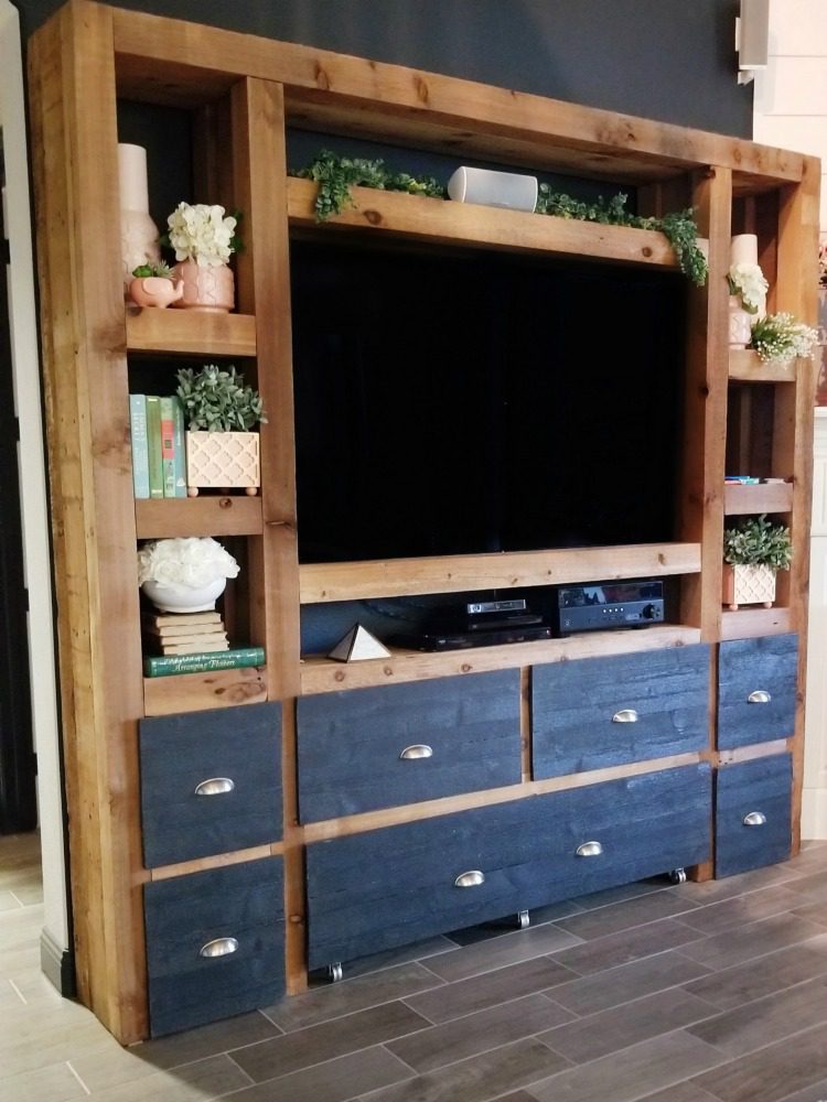
This is our previous entertainment center my husband built when we moved into our house. While it is a great piece (and built really well!) it never felt like the clunky rustic cedar fit in our new modern home. We painted the wall behind it a beautiful slate navy color, and it was hard to even see the new accent wall because the piece was so over powering. Even with the entertainment center being decorated and having a large presence, the TV was still the main focus.
THE ENTERTAINMENT CENTER AFTER
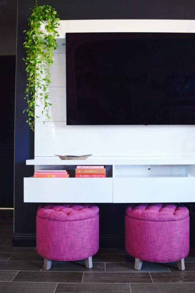
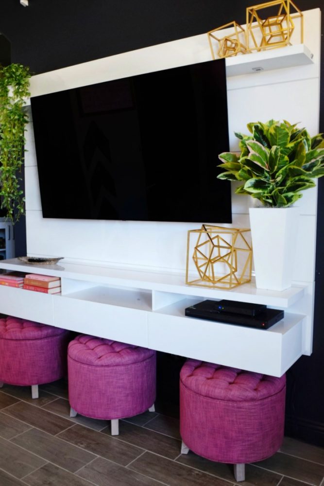
With our new entertainment center, the focus isn’t directly on the flatscreen but the whole design of the furniture and decor surrounding it. Its modern white design matches our current decor in this space while the openness helps highlight the accent wall behind it.
Visit The Home Depot Blog for my full blog post on my easy tips and tricks to work around your flatscreen by bringing in decorative furniture and decor accents that help steal back the spotlight from your TV!


Omg how awesome is this entertainment center. I just got an entertainment center, but haven’t figured out how to decorate it and make it a bit more functional.
Thanks Jennifer! That has been my struggle before this one too – it’s gotta be functional above everything else! Functional + stylish is a bonus!!
Girl I’m in love with how you styled this! Definitely inspiration for my new house next month!
Xx Tatyanna
These are absolutely beautiful. Less is always more for me with entertainment systems. Love the pink poufs!
I LOVE the whole set up! The white is so bright and clean too!!
I love the rustic wooden shelving unit with the added greenery! It can be difficult to display a flatscreen nicely, but these are all such beautiful ideas!
thanks Emily!
This post could not have come at a more perfect time. My current house has the TV above our mantle, but we move in 19 days and the new house has no fireplace and I was at a loss with what to do for the TV wall. This is simple and fun, I love it! And those storage stools are extra seating if you have more guests than your sofas can accommodate.
That’s so exciting Tilly!! Isn’t it a fun modern way to hang a TV? I love that it’s not clunky and over-powering! And you’re so right about the stools!! I was excited to add some extra seating in here, and it’ll be super helpful at our Super Bowl party this weekend!!
These are amazing ideas! I am kind of embarrassed the way my entertainment center looks now. Thanks so much for sharing. This is great Inso.
haha my other entertainment center was a mess 99% of the time!! I love that this one doesn’t really let me get it too messy, ha!